This post is part of my Visual Design module online portfolio
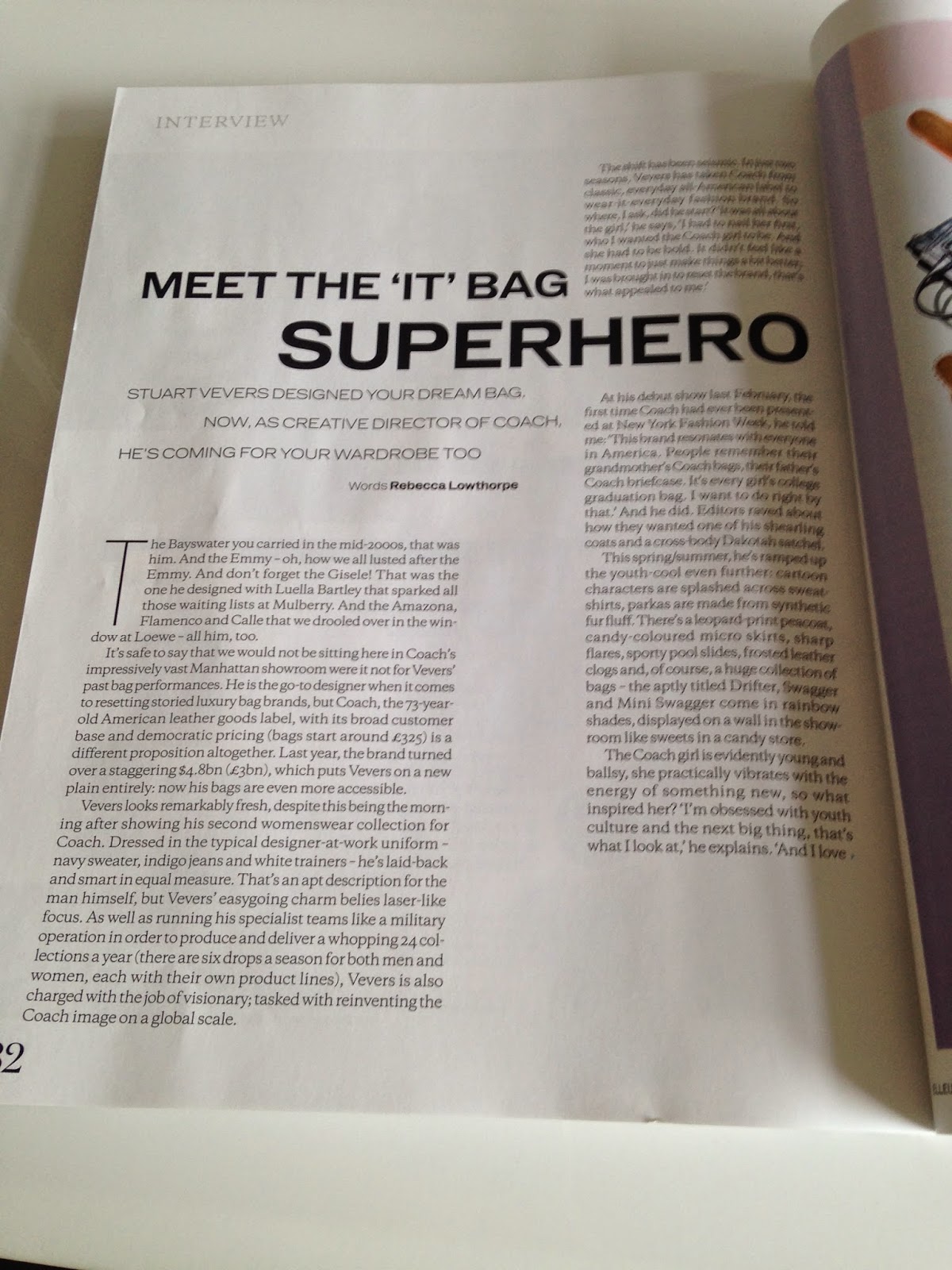
This week we looked into the structure of magazines and the use of grids. For my grid layout case study I have looked at two magazines the first one being 'Elle'.
This week we looked into the structure of magazines and the use of grids. For my grid layout case study I have looked at two magazines the first one being 'Elle'.
This magazine uses two columns for its layout, this makes the article easier to read and is pleasing for the eye. Although it seems quite traditional to have the two columns, the fashion magazine makes sure that the magazine doesn't appear 'boring'. They do this by breaking the grid by using pull out quotes and images which they incorporate into the main body of the text.
By using a monochrome style the magazine shows its simple, sophisticated and classy style that the magazine has. As a high-end fashion magazine this is an important aspect for them to portray to readers.
The designer makes sure the headline is the central piece of the article so that those just 'flicking through' will be drawn to the headline and hopefully be encouraged to read the article. In this particular example the designer has used the headline to break the grid, making the article even more exciting and unique.
The second magazine I looked at for this weeks task was 'Stylist'.
'Stylist' uses four columns for their grid layout, meaning that they have more choice of changing conventions within the style and breaking the grid. They can add pictures in and experiment with pull out quotes more as they have more scope to choose from. All of this makes the articles more interesting and appealing to the reader.
'Stylist' uses more colour than 'Elle' and they use a different colour scheme on each page. Even though the colour is different on each page this doesn't seem disorganised or wrong, it adds fun in to the magazine.
Stylist uses images on every page and on the first of each interview the interviewee's picture is usually central and takes up two grid spaces (as you can see with the 3rd picture). This draws the readers eyes straight to the picture where they can understand what the article is about without reading the headline or the words.
I personally prefer the style of the second magazine 'Stylist' I think it is more fun and more colourful making me want to read the content more.


No comments:
Post a Comment