Friday 27 February 2015

Best Dressed at the BRITS 2015

The BRIT Awards 2015 went off with a bang the other night, Kanye West scared 80% of viewers - including me, Taylor Swift won her first ever(HOW?) BRIT award & Madonna fell of the stage!! Drama, drama, drama. But besides all that, the red-carpet proved to be one of the best ever. 

Celebs never fail to disappoint at these high profile shows and the BRITS is one of the UK's biggest award shows which celebrates(in style) the previous year of British music. 

So who was best-dressed? 

Rita Ora 


Rita definitely knows how to turn heads, her dazzling sequin jumpsuit featuring a flowing train truly 'wow'ed us. 'The Voice' judge isn't afraid to show of her body which she proved by the daring neckline. Minimal jewellery and make-up ensured all eyes were on the gorges dress. 10/10 Rita, you go girl!


Michelle Keegan and Mark Wright 


The cutest and most gorgeous couple to grace the red carpet was none other than the beautiful Michelle Keegan and fiance Mark Wright, both British TV stars. Colour co-ordinating paid of for the pair who look every bit of the perfect couple. Michelle paired her LBD with a bright bag adding that bit of fun and pop of colour to her outfit. Michelle, we salute you. 


Kim Kardashian-West 


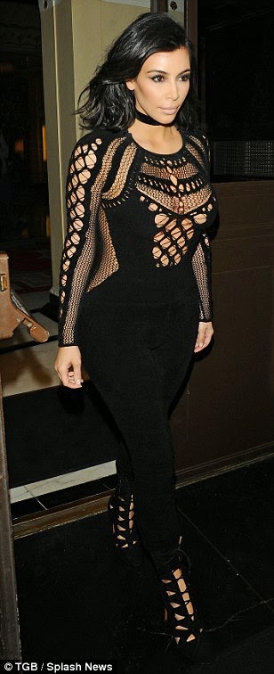
Kim K presented an award at the BRITS and introduced hubby Kanye West to the stage. She wore a fitted black jumpsuit which showed of her shapely derriere perfectly. Not only did she present Sam Smith with his global success award she also managed to fit in time (obvs) to take a selfie with presenters Ant & Dec. I must admit I'm not the biggest Kardashian fan but Kim sure did look fab. 


Ellie Goulding


Even though Ellie had a (very) awkward encounter on stage whilst presenting an award with Lewis Hamilton it didn't stop her looking drop-dead gorgeous, the white semi-sheer number is complimented by her undone hair and dressed-down jewellery. Simple yet elegant. Rockin' it as per usual. 


Taylor Swift


Last but certainly not least, (my fave) the ever-stunning Taylor Swift. The Queen of the red carpet blew us away with her floor length black gown which featured red detailing. Her make-up and hair was kept simple so the main focus was on the absolutely beautiful dress. In my eyes Taylor can do no wrong and this outfit reinforces that. Fantastic. 


Did you watch the BRIT awards? What did you think? Who was your best dressed? 

Wednesday 25 February 2015

Week 3: Analysing Logos

This post is part of my 'Visual Design' module online portfolio 


This simplistic logo is immediately recognisable, without any words or complications most people will associate the above logo with Nike. The swoosh, as it is called, represents motion and speed and is an onomatopoeia for the sound you would hear as Nike athletes wiz past you. In greek mythology 'Nike' is the Goddess of Victory, and the mythical associations for the brand are flight, victory and speed. Perfect connotations for the sports brand who sponsor many olympic athletes and sportspeople. The colour black again adds to the simplicity. 

The typography used in this logo is classy and appealing to the eye to represent the UK high street store. The store began as the young fashion section of Selfridges department store, therefore the design of the logo represents this classy look of the Selfridges brand. As the clothes, shoes and accessories Miss Selfridge sell are aimed at 'style-savvy' young women, the logo has to be fun, flirty and feminine to represent the pieces found in the store. 


Mini is a british car brand which manufactures small cars. Mini is owned by BMW and is known for its high performance. The circle in the middle of the logo proudly names the company in capital letters, the iconic winged design represents speed, power, freedom and agility. This recognisable car brand uses the colours black and silver, this is to show the class and elegance of the brand. It is very similar to its owners BMW logo who also use the circle shape with the name of company capitalised inside. 

-----------------------

I have chosen to use 3 logos that are all simple in design and in colour in order to compare them to each other. It is interesting to look into the logo of brands a little deeper and pick out why they have used certain characteristics and how this will help promote their brand. 

 My personal favourite logo between these 3 is Nike's swoosh, the simplicity of the design has such an impact on the viewer and is recognisable straight away. It represents the brand very well as the brand is a fast and dynamic. The swoosh also could be seen to be like a tick which represents a positive feel to the brand as if it is being approved by its viewers and users. 

Similarly, Mini uses the winged shape to create this positive feel. The shape of the wings makes the logo look like it could fly, which could represent the speed of the car. As mini ultimately want to sell these cars it is important for the logo to entice people in. 

The simple use of the colour black in all 3 of these logos shows that you can have a logo without any colour and still attract attention and be recognisable to the public. 


Monday 23 February 2015

How to keep sane whilst leading a busy life

Sometimes life can get in the way, your to-do list is the length of your arm and you are so stressed out you don't even know where to start. Here are my top tips for stopping yourself from going insane when life gets a little on top of you:

Have a routine 
Having a routine can really help keep you organised, for example I know my Uni timetable and the days I am at different jobs and try and stick to this every week if possible. Therefore you can work everything else around this and make the most of your time.

To-do lists
Ahhh, how do people live without a to-do list and a diary? I write everything down, relying on 'remembering' something does not work with me! I have a diary I carry round with me all the time and a desk pad which sits on my desk with a day-to-day schedule and notes for things I need to remember (ooh little miss organised)

What is your inspiration? 
Think of something you are looking forward to in the future, a holiday or a night out. Remember this when you feel like you are running round like a *madwoman* trying to get everything done. This will inspire you to keep going.

Think of the reward 
Every time something I have written gets published or a blog post gets lots of hits or comments I feel very rewarded and happy that I put in the effort(wooo). Sometimes the week gets a bit crazy and I sometimes don't want to write any articles or blogs but when it pays of it is rewarding, hold on to that feeling and it will make you want to do whatever it is you aren't too excited about.

Have in mind the end goal
Think of the end goal - why are you doing what you are doing? Is it towards your a-levels, your degree or is it to get more followers on your blog? Whatever it is, picture the end goal and it will motivate you. Picture yourself opening your results to 3 A's or B's or whatever you're aiming for, picture yourself getting to where you want to be and it will motivate you to do your best.

Get some sleep 
My best friend(sad I know), ultimately the more sleep you get the more energy you are going to have, the more you will be able to do in the day and the more 'up for it' you will feel and less sluggish and lazy.

Keeping one day completely to yourself
This is something I am adding into my routine. If you can, have one day completely to yourself, no work, no Uni work just a day doing what you want to do, seeing who you want to see and not worrying or stressing about the other things you need to do. This will keep you going throughout the week as well as you know that you are going to have your day off soon.


How do you keep yourself from going insane whilst leading a busy life? How do you combine blogging with a job or a degree? Any advice I can add into my life and routine?

Week 3: 'Bright Ideas Design' Business Card

This post is part of my Visual Design online portfolio 


For this weeks directed study task we were asked to create a business card for a 'young and funky' design company called 'Bright Ideas Design'. 

With this idea of young and funky in mind I decided to create a quirky and different logo for the company, I used the font Charlemagne Std as it is fun and different, which could represent the company themselves as they want to be seen as young and funky. By using a font that is a little bit different it adds to the 'young' feel that the company is going for and therefore shows I understand the design brief. 

I used a bright yellow background of the business card in order for the card to stand out amongst others, and the colour represents the 'bright' in the title of the company. For the same reasons I chose to use bright colours in each word of the company, by using the 3 different colours it adds to this 'funky' vibe that the company wants to represent. I added the black border around each letter of the words so that the word and company name wasn't lost in the colours. 

As the company wants to be seen as young and funky I assume it is aiming to communicate to younger people, therefore for the contact information I have simply used Twitter & Facebook. As young people today use these two social networks as a basis of communication more than they do email's and company websites. 

The font I used for the contact information is Bell MT, I chose this as it is simple and easy to read, which the company would want as they would want to communicate this information to young people who wouldn't really want to read through lots of information. 


Saturday 21 February 2015

Week 3: Journalism - Is it in crisis or is it exploding?

This post is part of my 'Journalism, PR & The Media' theory module online portfolio 

New media and technological advances cause the media industry to fear for the quality of journalism and the professional survival of the journalist. But, the set reading this week looks at this issue differently. Authors of 'The Future of Journalism: Networked Journalism" look at how this idea of new media does not represent a crisis in journalism, but in fact an explosion of it, suggesting that new media causes the profession to be more alive than ever.

Articles, stories and information is now much more accessible to the public. Thanks to technology the pubic now have many more stories to read, watch and absorb and on many different platforms, which are often free of charge e.g. twitter and blogs. According to the reading, good journalists in todays world are those who can tell fact-based stories through text, audio and visuals, stories which people can relate to and share.

The exchange between journalists and readers has changed, instead of a 'lecture' it is now a 'conversation' (Bradshaw 2011) Bradshaw also comments that there has been a massive power shift in terms of distribution, predominantly readers distribute a journalists work by sharing stories with friends or personal news feeds. Thus meaning, a journalists work is being read by a wider range of people, it can reach larger audiences and provoke more conversation all due to new media.

However, the industry believes Journalism is in crisis because people can get the information they want from multiple sources meaning they opt less frequently for newspapers and network television and more often turn to online news, radio and their smart phones. The willingness to pay for information has declined as it is so accessible for free, and now advertising is following readers to the Internet (Gluck & Roca, 2008) meaning that traditional newspapers and broadcast outlets are missing out on advertising payments.

Taking out this aspect of profitability, a journalists aim is to produce reliable information to the public. John Palvik believes this new media world will compel journalists to be even more attentive to detail and accuracy as feedback can be swift, hard-hitting and self-correcting. Palvik views technological change as an opportunity to slow if not stop the media's long decline in credibility and audience.

I find this area of study extremely interesting as I myself use the internet and free online recourses to access news over buying the newspaper, and I actively use blogging and twitter to join in conversations. If I was to look into this topic further I would use an interview/ethnography as my methodology. I would speak to current journalists and ask about their own experiences with new media and the if their practices have changed due to technology. I would also read further into the topic using academic texts. 

Bibliography:

1) Bregtje van der Haak, Michael Parks, Manuel Castells (2012), The Future of Journalism: Networked Journalism

2) Pavlik, J. (2001) Journalism and New Media. United States: New York : Columbia University Press, c2001.

3) Long, P. Wall, T. (2012), Media Studies, Texts, Production, Context (2nd Edition), New York, Routledge

Thursday 19 February 2015

ScandalEyes Mascara by Kate Moss


Omg. Are you aware of ScandalEyes by Kate Moss?! If not... my gosh are you missing out. Having stumbled across this little beauty in boots I feel like fate has bought us together, I could not have wished for anything else in a mascara and I am so excited to share it with you all. The broken heart shape of the brush creates a perfect curl to the lashes. The thickness of the bristles adds the perfect volume to your lashes, and the application is oh so easy. I choose to use the colour Jet Black, but there also THREE other colours to choose from: Saphire. Emerald and Amethyst all of which would be good if you like going for brighter eye make-up on a night out, but these colours don't quite sit as well with me as the traditional black does. At just £7.49 in boots, I think this is the perfect drugstore mascara and it has made its way to my top draw and features in my everyday make-up.

What is your favourite drug store mascara? Have you tried this product? Let me know!


Wednesday 18 February 2015

Week 2: Typography in the wild

This post is part of my Visual Design module online portfolio. 


This is the poster/advert for the limited edition Urban Decay 'On The Run Naked Palette.'

The text for this advert is all central, the designer may have done this to immediately draw the reader to the text rather than the photos that are also used. 

The word 'Naked' is capitalised and uses a larger font size in order to tell the reader the product immediately. People who know Urban Decay will automatically know the brand 'Naked' that is why the designer has made this word central and bigger.

'On the run' is in italics and has an effect on the text to make it look as though it is running, this onomatopoeia makes the advert a little bit more fun which represents the fun brand that Urban Decay is. The effect also makes the text stand out, the designer wants it to stand out as this is the product the company are trying to sell and promote.

'New Limited-Edition' is the first text used on the poster this is so that as soon as the reader starts to read the advert they know it isn't any old Naked Palette is in fact a new special one, that is limited edition - therefore making them want to know more straight away.  


The typography used on this poster is fun and childlike to represent the young audience the film is aimed at. The designer may have chose to use the 'swirly' style font to represent the trees and branches in the jungle or the character of Kaa the snake. 

The typography under the image of 'THE JUNGLE IS JUMPIN''' is a different font than the main title. 'JUMPIN'' is in italics, the designer may have done this to portray the word as literally jumping of the page, making the poster more fun and appealing to children. 

The tracking of the words is very tight/small and the letters are close together. This adds to the childlike effect as children are taught to join up their handwriting and this mimics that type of style. 

The title of the film is central on the poster and each word is on a separate line to keep it in the middle. The designer may have done this in order to draw the reader into this as the main text, allowing the type to immediately tell the audience what the poster is about as it isn't hugely obvious by the image used. 

The names of the actors doing the voice overs use capitalisation and lowercase letters in order to emphasise the surnames of the actors and once again, capture the attention of the viewer. 


This Evian logo uses the font helvetica and they used it in their recent campaign. The campaign used babies in adverts and posters to promote the brand.

The Evian logo is easy to spot as it is always in lowercase helvetica and the reddish colour in font. The company proves how important is to have a coherent theme within your product as it makes people spot the brand easier when shopping. 

The lowercase of Evian links in with the 'live young' campaign and using babies as part of their adverts as young children and babies use lowercase letters when learning to read, write and talk.

Evian might have decided to use helvetica because of its simplicity and easy nature to read. It is easy to spot, you can see clearly what the word says and it is neat. 'Live young' is also part of this simple style Evian have chosen to use as it is a simple and easy statement. 


Week 2: The increasing power of the PR industry

This post is part of my 'Journalism, PR and The Media' theory module online portfolio 

The media is a very powerful tool in many ways; it can affect peoples behaviour, it can make individuals powerful, and it can influence public opinion. Media professionals have the ability to reach large audiences with their ideas and messages, whether it be through writing articles or producing TV documentaries. People now fear that media owners have influence over public opinion and behaviour as a result of their powerful position.

Last week we looked at the relationship between Journalism and PR but this week I am going to look more in depth at the power of the PR industry and how it can influence public opinion.

Julia Hobsbawn comments that 60% and more commonly 80% of any broadcast or broadsheet outlet has got a PR element in it. Thus suggesting that the PR industry has an increasing level of power over the news media. It could be argued that PR specialists use Joseph S. concept of soft power in order to get positive coverage in the media for their client. But is this coverage a representation of Karl Marx' theory of ideologies and are the press releases and press packages that fill our newspapers and magazines presenting ideologies rather than fact in order to shape a positive view of the client?

PR specialists are taught to learn how journalists think and work so that they can use specialised techniques to target the journalist and get the media coverage they desire for their client - thus, giving them them even more power over the journalist. The PR specialist has the power to speak to sources and get all the information the journalist would want for their story. Whereas the journalist might struggle to get this information out of the company themselves. For example the press department at the local council will be able to get all the information they need for their quotes and press releases but a journalist would struggle to get such information.

Last weeks reading spoke about the relationship between journalism and PR negatively, putting most of the blame on the PR sector, blaming them for the crisis journalism is going through. However, this weeks reading portrays less of this negativity and instead looks into the relationship from an unbiased viewpoint and concludes that journalists do in-fact need PR in order to fill their ever increasing publications.

The 'conflict' relationship presented recently is now seen as a 'trading' relationship. Journalists working in under-resourced and under-staffed newsrooms increasingly rely on PR sources to get them stories (Davis, 2002; Jones 2006; Larson, 2002; White and Hobsawm, 2007). The reading concluded how reliant current news is on PR by using charts, tables and various figures to support its statements.

Bibliography:

1) Justin Lewis, Andrew Williams & Bob Franklin (2008): A COMPROMISED FOURTH ESTATE?, Journalism Studies, 9:1, 1-20

2) Long, P. Wall, T. (2012), Media Studies, Texts, Production, Context (2nd Edition), New York, Routledge


Related Posts Plugin for WordPress, Blogger...