This post is part of my Visual Design module online portfolio.

This is the poster/advert for the limited edition Urban Decay 'On The Run Naked Palette.'
The text for this advert is all central, the designer may have done this to immediately draw the reader to the text rather than the photos that are also used.
The word 'Naked' is capitalised and uses a larger font size in order to tell the reader the product immediately. People who know Urban Decay will automatically know the brand 'Naked' that is why the designer has made this word central and bigger.
'On the run' is in italics and has an effect on the text to make it look as though it is running, this onomatopoeia makes the advert a little bit more fun which represents the fun brand that Urban Decay is. The effect also makes the text stand out, the designer wants it to stand out as this is the product the company are trying to sell and promote.
'New Limited-Edition' is the first text used on the poster this is so that as soon as the reader starts to read the advert they know it isn't any old Naked Palette is in fact a new special one, that is limited edition - therefore making them want to know more straight away.

The typography used on this poster is fun and childlike to represent the young audience the film is aimed at. The designer may have chose to use the 'swirly' style font to represent the trees and branches in the jungle or the character of Kaa the snake.
The typography under the image of 'THE JUNGLE IS JUMPIN''' is a different font than the main title. 'JUMPIN'' is in italics, the designer may have done this to portray the word as literally jumping of the page, making the poster more fun and appealing to children.
The tracking of the words is very tight/small and the letters are close together. This adds to the childlike effect as children are taught to join up their handwriting and this mimics that type of style.
The title of the film is central on the poster and each word is on a separate line to keep it in the middle. The designer may have done this in order to draw the reader into this as the main text, allowing the type to immediately tell the audience what the poster is about as it isn't hugely obvious by the image used.
The names of the actors doing the voice overs use capitalisation and lowercase letters in order to emphasise the surnames of the actors and once again, capture the attention of the viewer.
I found this image at: http://ollymoss.com/#/the-jungle-book/
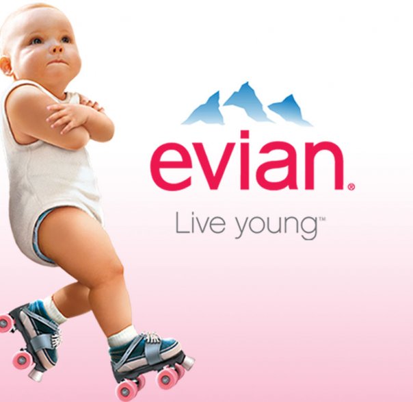
This Evian logo uses the font helvetica and they used it in their recent campaign. The campaign used babies in adverts and posters to promote the brand.
The Evian logo is easy to spot as it is always in lowercase helvetica and the reddish colour in font. The company proves how important is to have a coherent theme within your product as it makes people spot the brand easier when shopping.
The lowercase of Evian links in with the 'live young' campaign and using babies as part of their adverts as young children and babies use lowercase letters when learning to read, write and talk.
Evian might have decided to use helvetica because of its simplicity and easy nature to read. It is easy to spot, you can see clearly what the word says and it is neat. 'Live young' is also part of this simple style Evian have chosen to use as it is a simple and easy statement.


No comments:
Post a Comment